Introducing New Charts Control in DronaHQ
Build interactive data visualization dashboards
The world is full of overwhelming amounts of data and constantly flowing information. For businesses, decoding the data correctly is essential to allow people to be successful in their work. Just like the breaking down of oxygen in our bodies to keep every part of the organization running smoothly.
Dashboards allow users to make sense of large data sets by means of data visualization. They make it easier to reduce the amount of work your users need to do to extract insights and charts are key tools to focus the user’s attention to critical information to scan and consume data from the dashboard. As a result, developers and data analysts spend valuable time building dashboards that allows teams to draw insights from.
We have noticed that, when it comes to simple data visualizations like how much the office admin has spent over the pantry this week or how much closer we are to our sales goal for the month. By means of static charts, you can convey the information. But as your data starts to become more complex, you need to create visualizations that are interactive and responsive to data changing in real-time.
However, we feel the data does not always come in formats that can be easily comprehended. Your charts need to read from your columnar or tabular data as well as JSON objects.
Today we are excited to announce the GA launch of our new charts control. Now you can bring your data to life with custom and interactive visualizations to every app you build in DronaHQ.
Motivation: Build interactive data visualization dashboards with Charts
Our new Charts control makes it easy to design and consume information in the form of charts and graphs. For app makers, it’s simple to build charts right out of the box with all of the basics like Bar charts, Line chart, Scatter chart and Pie chart included.
And because you are using these charts in DronaHQ, app builders can also configure ‘click events’ in the charts so as to allow users to take actions on the charts such as navigate to screen, write to database, call an API, send message to Slack, compute a value, or whatever the use case calls for.
In addition to actions, the charts also support data aggregation functions such as Sum, Count Average, Median, and more. There is also a group by property using which users can specify the column to group data depending upon the type of data.
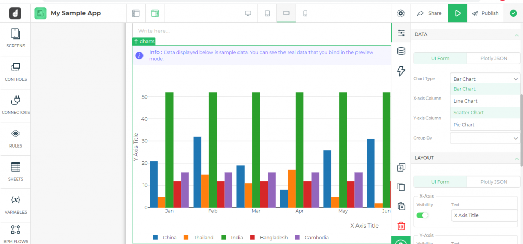
DronaHQ’s chart component is powered by the open source Plotly library, so developers and data scientists versed with Plotly Json data and layout attributes can build advanced visualizations and mixed charts using Plotly’s JSON schema format. With this control we give our data science friends already using Plotly the ability to use their existing visualizations on DronaHQ without having to learn any new syntax.
This chart control makes it possible to create drill down reports. The end users can click through the charts to scan through multiple layers of information and apply that to any other logic on the DronaHQ actionflow.
See how you can start using Plotly charts in DronaHQ >
Putting the charts to use
As the charts control started rolling out, we’ve seen our customers build powerful dashboards, database GUIs and admin panels to discover potential issues in their processes, investigate trends, or to give an overview of the performance.
ITeS company builds an employee exit dashboard
A ITeS customer used the charts control to create an employee exit dashboard on top of their employee database housed in Firebase database to quickly drill down and analyze how frequently employees are leaving the company and what are their reasons for doing so.
They already use DronaHQ for other employee-facing apps like approval queues, attendance, employee onboarding and so on.
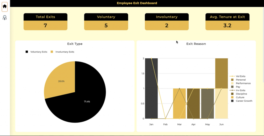
In addition to using pie charts and bar charts that show involuntary exits vs voluntary exits, and reason for exit respectively, they also used Ploty chart capabilities to create an advanced insights dashboard.
They used the columns of data added here to display the graphs by setting them up in the properties section. For the advanced graphs, they used JSON to define precisely the properties required, and enabled them to interact with the Firebase data by simply mentioning the column in double braces like – “locations”: “{{result.Location}}”.
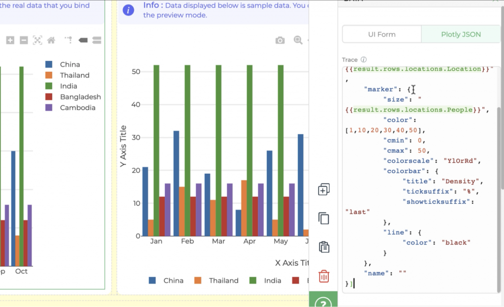
They use a geo bubble map to plot a distribution of how many employees from each office location exited per month. This is helping them identify locations where employees were most dissatisfied and needed immediate action. With an interactive sunburst map to build a department distribution of the organization, they are finding out how many employees quit per month from each department, grouped by location. This is allowing them to drill down under each department and find out the most problematic ones.
A stationery manufacturer creates a sales and support dashboard
A stationery manufacturer using DronaHQ to run a custom CRM and power SDR teams with a tool for their day to day lead management activities.
Sales dashboard is a critical tool they have been building with us to know how their accounts have been growing or how their efforts are adding up to their sales goals.
With the new charts control they now track their goals in real-time, using aggregations to plot the data and identify patterns. They are able to map out support request trends. Using a
time series activity graph, the customer success team can get the insights needed to help customers.
By allowing users to add charts, graphs, and other forms of reporting dashboards right where the action happens, we are empowering the executives and data analysts with strategic tools that are operational to closely monitor business activities or daily performances.
We are thrilled to share this new chart control with our low-code community and are excited to hear the interesting visualization tools you build with them. To learn more about the chart control, check out our community or login to DronaHQ to start using charts for your own data sets.

Related Articles